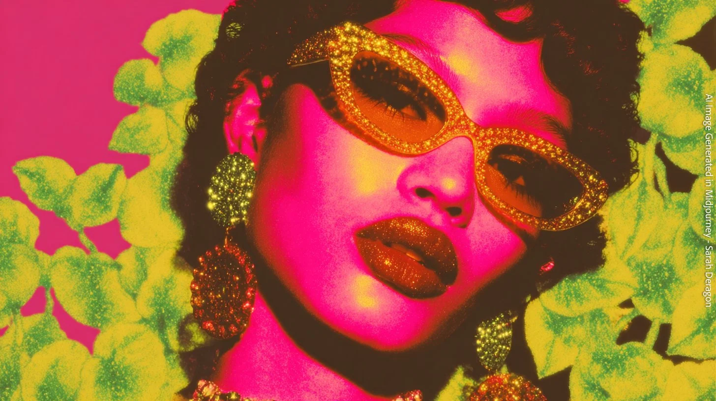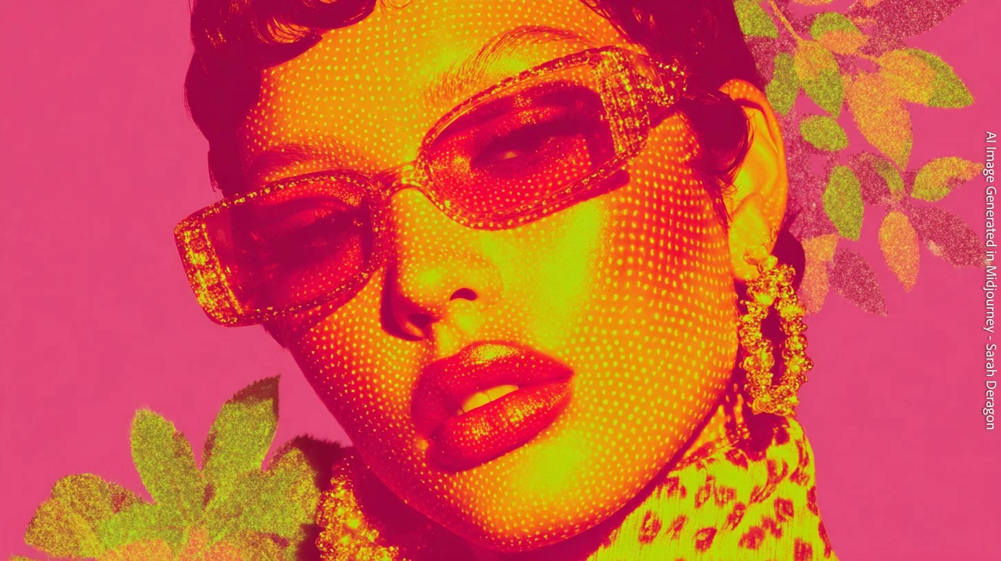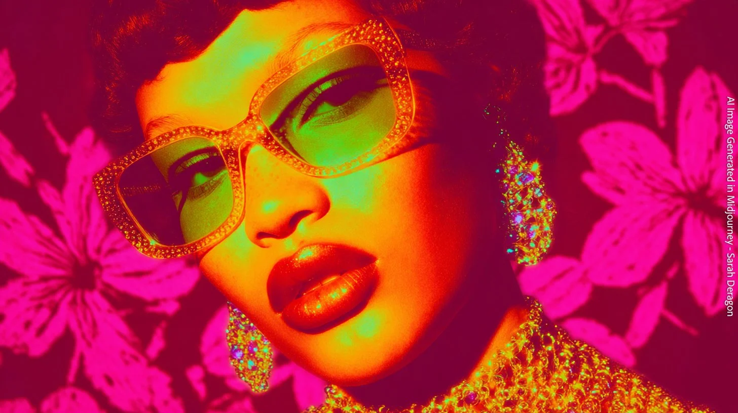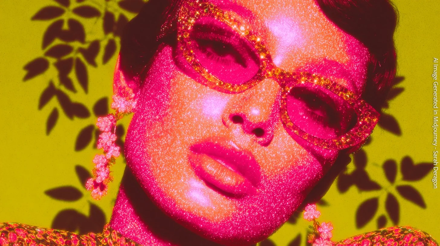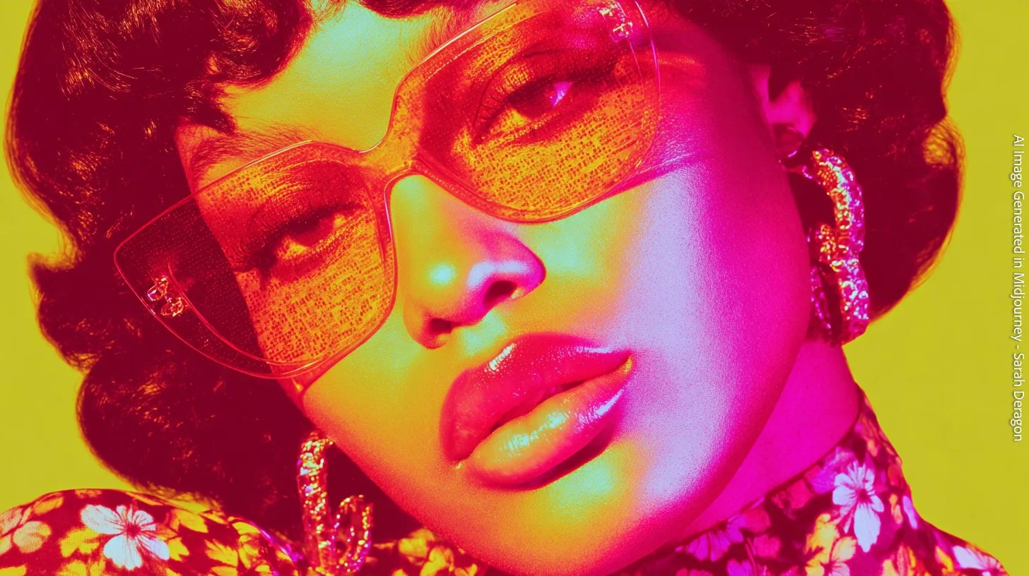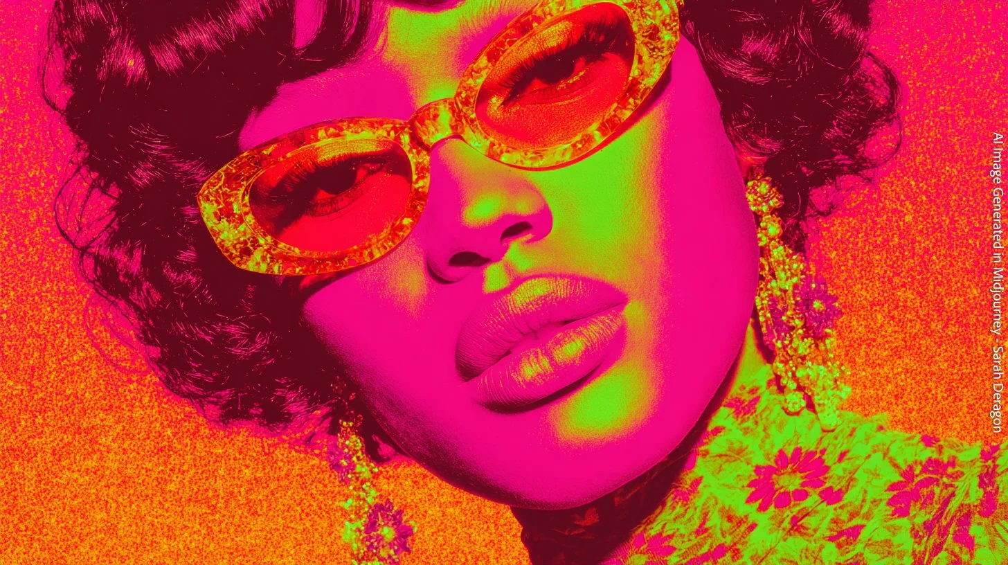

Chromatic Icons — Case Study
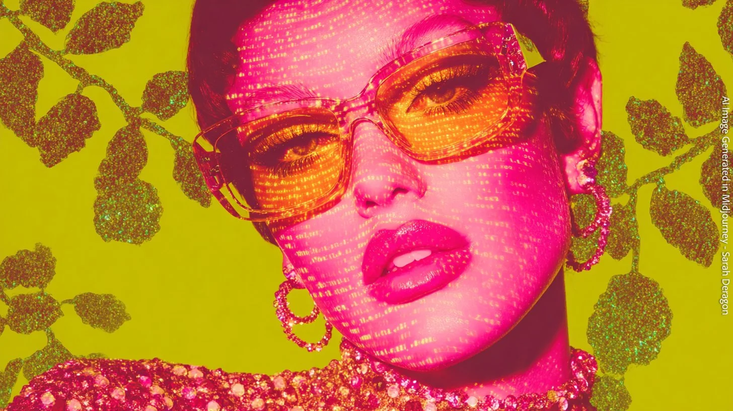
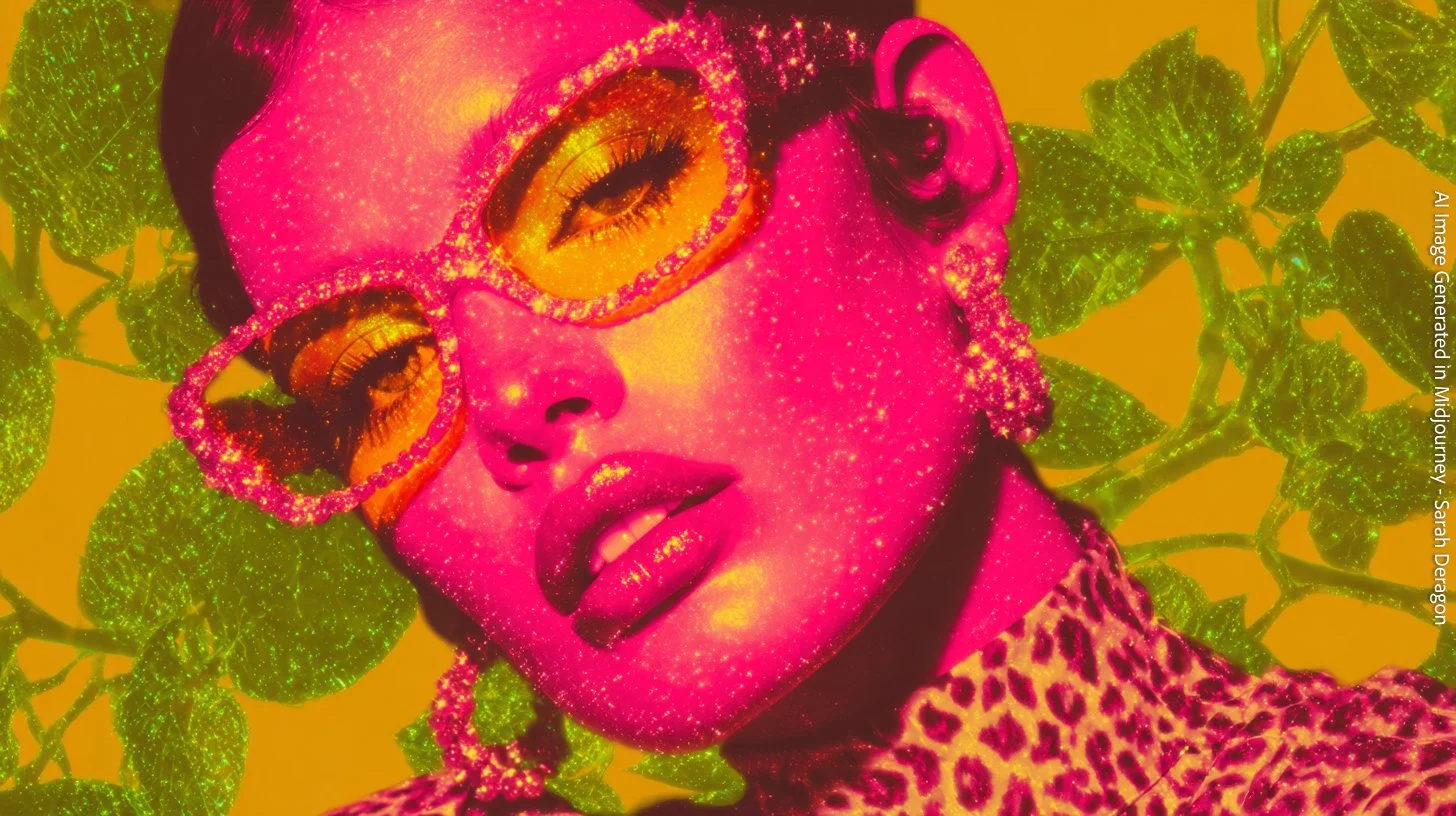
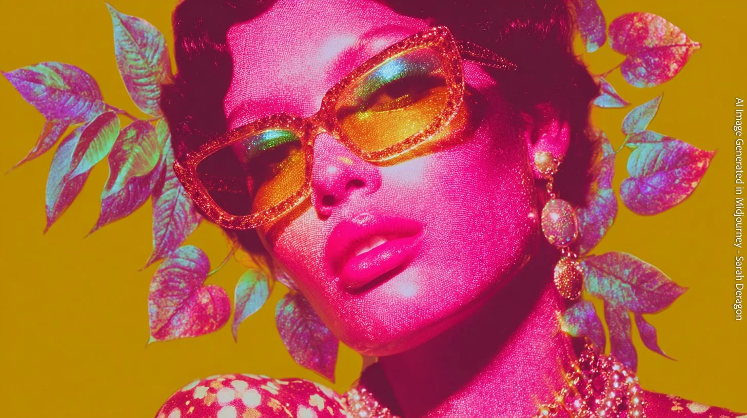
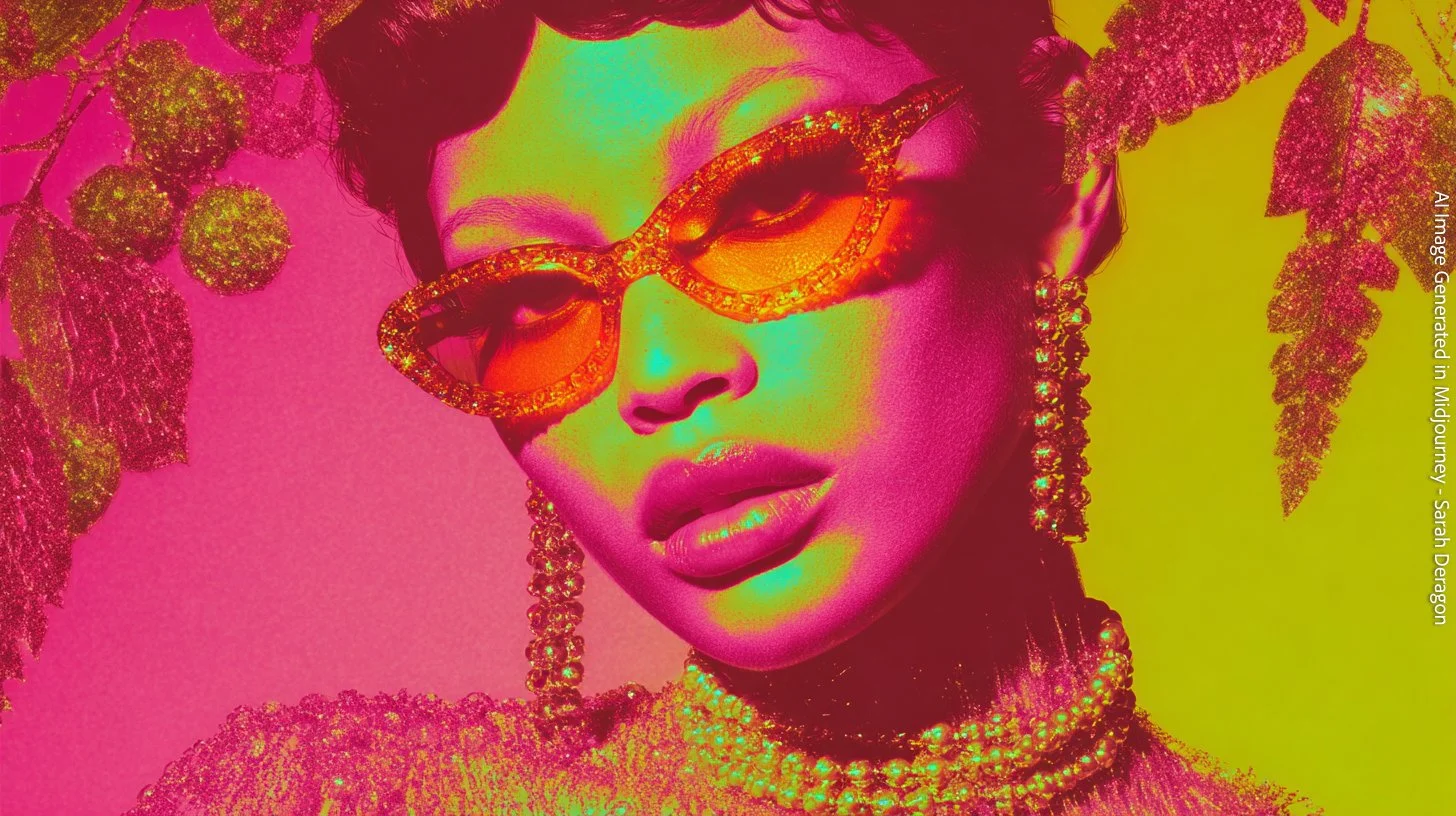
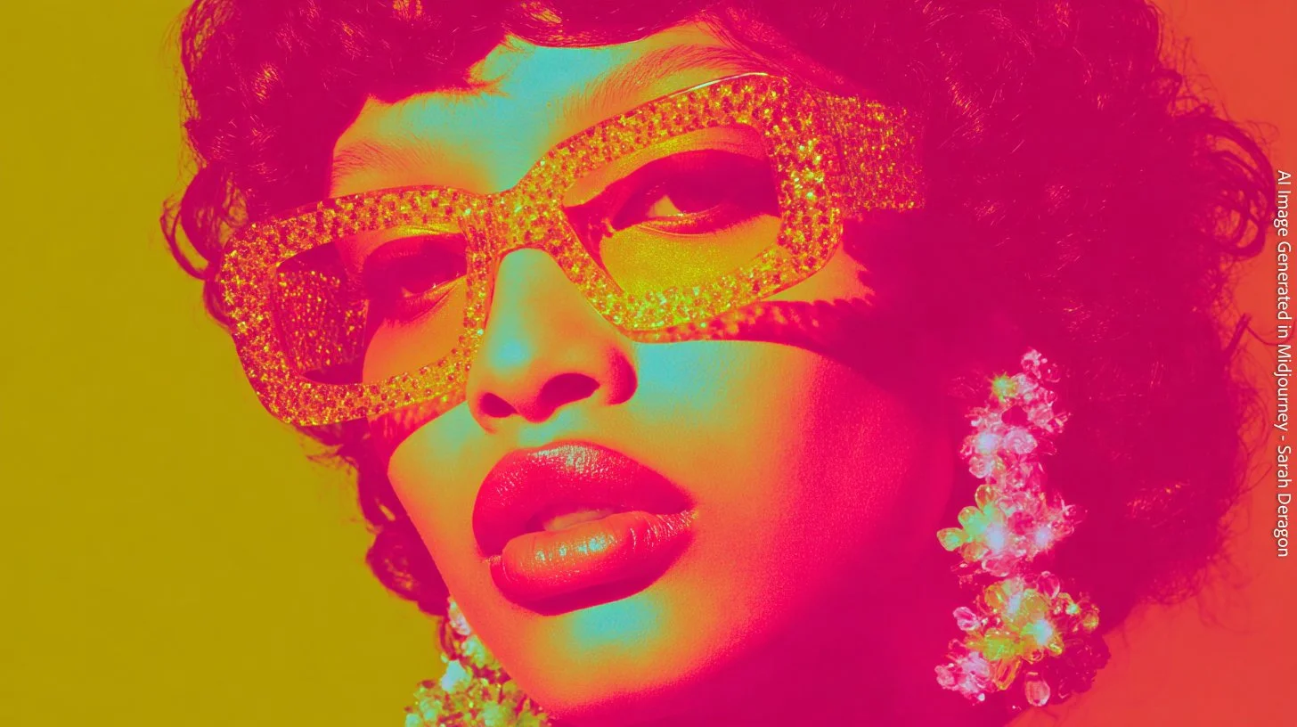
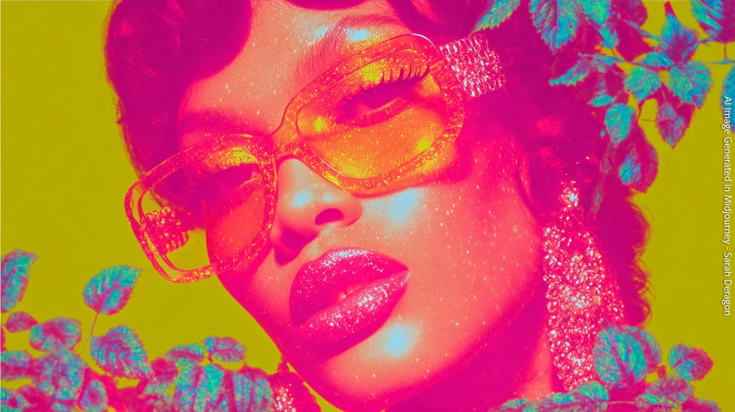
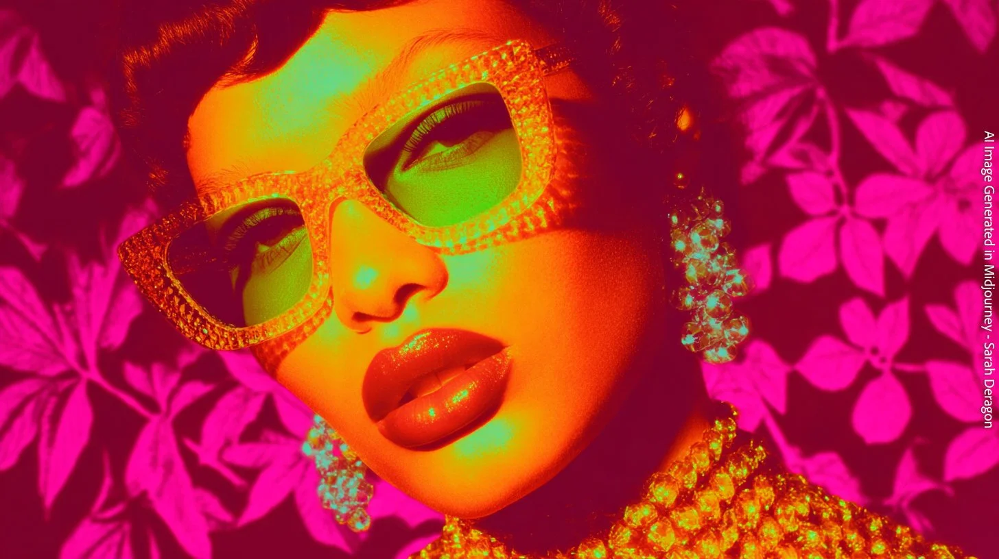
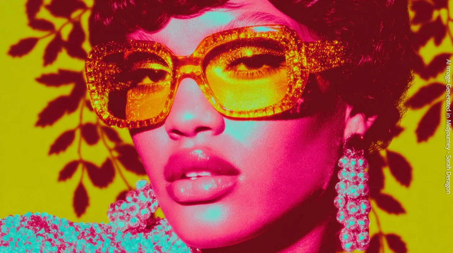
This series is built entirely around two colors I love—vibrant pink and electric yellow—and the bold, hyper-stylized world they create together. I wanted the images to feel graphic, confident, and a little surreal, almost like editorial portraits crossed with pop-art illustrations. The look is intentionally pushed: glitter, grain, gloss, and unapologetic saturation.
Before AI, creating a series like this would have required a huge team and budget: custom stylists, prop sourcing, wardrobe pulls, makeup and glitter artistry, set design, lighting tests, and days spent refining the exact tones. It’s a level of visual intensity that most small brands or publications simply couldn’t afford to commission.
But with AI, I was able to sketch and build this universe quickly, experimenting with color, texture, and mood until the series clicked into place.
Where These Images Shine
These portraits work beautifully for:
• editorial layouts (fashion, beauty, culture)
• album covers or single artwork
• brand identities looking for bold color stories
• campaign moodboards
• social media graphics
• newsletter headers or feature sections
• creative direction references
Chromatic Icons shows how AI can turn pure color obsession into a fully realized visual world—something striking, memorable, and commercially versatile.